Thursday, February 25, 2010

WEEK 6 LAB: GEOREFERENCING

This lab was simple but it took forever to do! Working with the imagery was extremely slow and although I wanted to spend more time putting together the map, it took me hours just to get to this stage.

Sunday, February 21, 2010

WEEK 5 LAB: DATA SEARCH

Wow, this has been quite some lab!! And judging by the discussion posts, I am not the only one who thinks so. I have learnt a lot though and its been a good revision of what we have learnt so far.

MAP 1. RASTER DATASETS


MAP 2. INVASIVE PLANTS AND STRATEGIC HABITAT CONSERVATION AREAS


MAP 3. PUBLIC LANDS, HYDROGRAPHY, ROADS AND CITIES


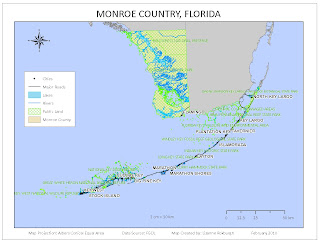
I was excited about the fact that I was doing Monroe County, the Everglades State. But it was challenging to try to represent the public lands and the hydrographic features, since much of the state seems to be under water and public land. The Keys were particularly challenging since they are so small relative to the mainland, but also very long for an inset map. Hopefully with more experience I will learn how to do a better job.


Thursday, February 11, 2010

WEEK 4: HAITI EARTHQUAKE

I found the following two maps when searching for good and bad maps for our Cartography course. I was interested to see how satellite imagery was used to assess the extent of damage (in the first map) and to be able to pinpoint physical barriers to providing humanitarian disaster relief (in the second map). The first map would have been useful to pinpoint areas to focus relief efforts upon. And the second map would have been useful to plan the logistics of early relief efforts.


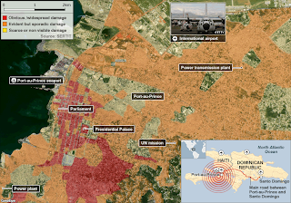
With such awesome technology at the relief agencies fingertips one does rather wonder what went wrong. However, this being the poorest country in the western hemisphere (aided and abetted by the IMF and their ilk I see), I expect the logistical challenges to the relief efforts would be similar to here in Malawi, where we had our own little earthquake hours before the Haiti Earthquake struck. No casualties for that one, although 1000s of people remain homeless in Karonga district after a flurry of earthquakes over the past few months.


Wednesday, February 10, 2010

WEEK 4 LAB: PROJECTIONS OF FLORIDA

This week's assignment introduced us to different map projections or coordinate systems. We used a map of Florida to compare three different coordinate systems: Albers, State Plane and UTM.


The area for Escambia county differed the least between projections while that for Miami-Dade differed the most. Escambia is the most northerly county and Miami-Dade the most southerly. This difference probably occurred because we used State Plane Florida North and UTM 16 N. Escambia county falls within these zones, whereas the other two counties fall within UTM 17 N and one of the other State Plane zones. We would therefore expect more distortion of areas in counties within these zones. The Albers projection should show the correct area of each county as it is an equal area projection.

Friday, February 5, 2010

WEEK 3 LAB: MEXICO

Our task this week was to play around with data from Mexico.


MAP 1

Clear, simple and straightforward. I have now learnt how to move the continents around and place them better within the map. So much for continental drift ...


MAP 2
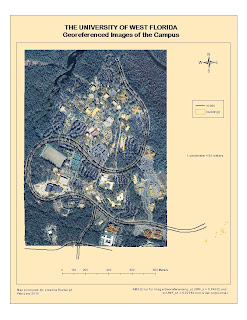
This was a difficult map to do in terms of making it look good. The map is cluttered and I am not sure what the purpose of this map would be (other than to have us practice making a map). I stumbled upon the setting to add a halo around the text and I think it helps to make the annotations on the map clearer.


MAP 3


My first attempt to display a raster data set. I would not have thought so, but I like the contrast between the red and blue in terms of showing elevation. Blue is usually reserved for water features, but it was fun being able to use it to represent land for a change.

Monday, February 1, 2010

Week 2 Lab

World Population Map


The most difficult thing about this week's assignment was the map layout. How to align scale bars and scale text and sizing the map correctly was not immediately obvious.