The area for Escambia county differed the least between projections while that for Miami-Dade differed the most. Escambia is the most northerly county and Miami-Dade the most southerly. This difference probably occurred because we used State Plane Florida North and UTM 16 N. Escambia county falls within these zones, whereas the other two counties fall within UTM 17 N and one of the other State Plane zones. We would therefore expect more distortion of areas in counties within these zones. The Albers projection should show the correct area of each county as it is an equal area projection.
Wednesday, February 10, 2010
WEEK 4 LAB: PROJECTIONS OF FLORIDA
This week's assignment introduced us to different map projections or coordinate systems. We used a map of Florida to compare three different coordinate systems: Albers, State Plane and UTM.
The area for Escambia county differed the least between projections while that for Miami-Dade differed the most. Escambia is the most northerly county and Miami-Dade the most southerly. This difference probably occurred because we used State Plane Florida North and UTM 16 N. Escambia county falls within these zones, whereas the other two counties fall within UTM 17 N and one of the other State Plane zones. We would therefore expect more distortion of areas in counties within these zones. The Albers projection should show the correct area of each county as it is an equal area projection.
Friday, February 5, 2010
WEEK 3 LAB: MEXICO
Our task this week was to play around with data from Mexico.
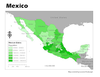
MAP 1

Clear, simple and straightforward. I have now learnt how to move the continents around and place them better within the map. So much for continental drift ...
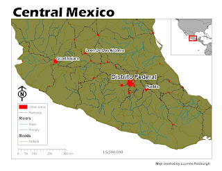
MAP 2
This was a difficult map to do in terms of making it look good. The map is cluttered and I am not sure what the purpose of this map would be (other than to have us practice making a map). I stumbled upon the setting to add a halo around the text and I think it helps to make the annotations on the map clearer.
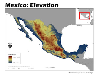
MAP 3

My first attempt to display a raster data set. I would not have thought so, but I like the contrast between the red and blue in terms of showing elevation. Blue is usually reserved for water features, but it was fun being able to use it to represent land for a change.
MAP 1

Clear, simple and straightforward. I have now learnt how to move the continents around and place them better within the map. So much for continental drift ...
MAP 2

MAP 3

My first attempt to display a raster data set. I would not have thought so, but I like the contrast between the red and blue in terms of showing elevation. Blue is usually reserved for water features, but it was fun being able to use it to represent land for a change.
Monday, February 1, 2010
Week 2 Lab
World Population Map
The most difficult thing about this week's assignment was the map layout. How to align scale bars and scale text and sizing the map correctly was not immediately obvious.
Subscribe to:
Posts (Atom)