Thursday, July 22, 2010

WEEK 10. Homeland Security

Our assignment this week was to use data we prepared last week to assess locations of critical infrastructure and various line-of-sight surveillance points in relation to NORAD command center at Cheyenne Mountain, Colorado.

This lab went fairly smoothly for me. Despite my slow server, I think I have the advantage of working in a different time zone, and not 'sharing' ARCGIS with many other users.

To anyone living in the developing world, NORAD has a completely different meaning. It's the Norwegian Agency for Development Cooperation, a major donor in this part of the world. So this acronym was a little confusing for me to associate with American Homeland Security.

Map 1. Location of the heliport


Map 2. Egress and Ingress points into the Heliport buffer zone.

Thursday, July 8, 2010

WEEK 8. DC Law Enforcement

1. Base Map of Washington DC


2. Proximity of Crimes to Police Stations


3. Kernel Densities of Various Crimes

Tuesday, June 29, 2010

WEEK 7. Wildlife Crossings

SCENARIO
Funding is available to build a new wildlife crossing for Florida Black Bears (Ursus americanus floridanus), which are a threatened species. Wildlife crossings reconnect habitats, allowing animals to cross roads safely. They help to reduce the number of accidents involving wildlife.

LOCATION DECISIONS:
In which county should the crossing be built?
Marion County was chosen as the county with the highest number of roadkills, and with no wildlife crossings.

Where in the county should the crossing be built?
Five criteria were chosen to guide the site selection process. These were
1) Proximity to the county seat (one of the main reasons for failure of wildlife crossings is that they are not maintained. My reasoning was that the closer they are built to a town, the more likely they are to be maintained)
2) Proximity to active landfills (bears eat trash and the further away from a landfill site, the better, as one would not like to provide an easy conduit for bears to gain access to a landfill site)
3) Human population density (low human population density is preferred)
4) Proximity to public land (close to or within a protected area is best)
5) Density of bear roadkill (the more bears are killed on the road in a particular site, the greater the need for a safe wildlife crossing, for both bears and people)

1. Base Map of Marion County, Florida


2. Maps of the five criteria chosen for site selection


3. Maps of two weighted overlay analyses identifying suitable sites


Three sites to the east of the county seat Ocala, were identified as the best sites by both analyses.

Tuesday, June 22, 2010

WEEK 6. Location Decisions

I have not used portrait format for my maps very often, and I enjoyed trying out and gaining experience with this format. Otherwise the lab went smoothly, its great to see what spatial analysis capabilities ARCGIS has.

1. Base map of Alachua County:


2. Map of Four Site Selection Criteria:


3. Map of two overlays:

Monday, June 14, 2010

WEEK 5. Urban Planning and Impact Assessment

This was a straightforward lab. I ran into the problem with adding a field in the first exercise, but switched to the corrected folder and files, which worked fine. I had a problem again in one of the later labs (Economic Impact assessment) where I was required to add a field to a table. Fortunately this step was not needed to complete the lab and create the neccessary maps.


Friday, June 11, 2010

WEEK 4. Oilspill Animation and Participation Post

Click here to view an animation of the Deepwater Horizon oil spill


Participation Post

Summarize the role of GIS in disaster response and discuss how it relates to the Deepwater Horizon oil spill event occurring in the Gulf of Mexico

After a disaster has happened, GIS plays an important role in understanding what happened and where. Because of its excellent visualization and data consolidation capabilities, GIS is particularly suited to this task. The next step in disaster response and recovery is understanding what help is needed and where. GIS is gradually becoming more widely used as part of a traditional disaster response.

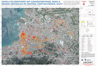
In the immediate aftermath of a disaster, GIS is used to map, or model, the damage – this allows immediate disaster response teams to target the areas most in need. This early mapping or modelling of the disaster can be expanded upon later to help longer term recovery and reconstruction to target the right areas, and is an especially important tool for planning the clean-up of debris.

Another important function of GIS in disaster response is to keep the public informed. This relates particularly to keeping the directly impacted communities up-to-date on aspects of damage, disaster response and clean up and recovery efforts, but is also important for the news media who increasingly use maps in news stories.

One particularly useful function for disaster response is that maps and other products can be produced on demand and tailored to the specific needs of those requesting the products. Thus GIS can produce anything from urban maps for search and rescue teams, to 3-D images of debris piles, to models of earthquake damage.


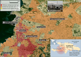
How does it relate to the Deepwater Horizon oil spill event?

GIS plays a key role in keeping the public informed of the oil spill. Oil spill maps show the extent of the oil slick, the movement of the oil, and the areas which could come under threat from the oil. It is also being used to inform the public about fishing bans and health risks associated with the oil spill. GIS modelling is being used to model the spread of the oil, and to predict where oil will make landfall next. Thus communities can prepare themselves for a response.

GIS is being used to map the areas affected by the spill, which is useful both for disaster response as well as for historical documentation of the oil spill disaster. Both ecological and socio-economic impacts of the oil spill can be mapped, and used for immediate disaster response and clean-up, as well as for future compensation of communities for loss of income and damage to property.

Thursday, June 10, 2010

WEEK 4 Oilspill

I am a little late on this one due to our internet connection crashing for 24 hours.

Here's the Google Earth Image of the fishing ban:


This was quite a challenging week, but interesting and topical. I would have liked to have had more time to do this and explore the data and the issues more. But time marches on.

I chose the Indian Pass quad as it looked it would be an important area for bird conservation.


The topographic quad did not look very good as a background, so I chose not to use it for two of the maps.

Wednesday, June 2, 2010

Wednesday, April 28, 2010

FINAL PROJECT 2010

Bobwhite-Manatee Transmission Line Project


Slideshow


Slide Summary

Thursday, April 8, 2010

WEEK 11 LAB: ESRI Excercises

1. Creating and Editing Labels and Annotation - useful tools to learn - there's so much more to labelling than I could have imagined!

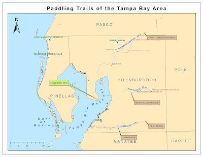
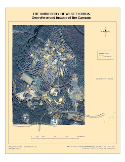
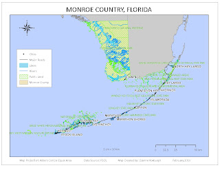
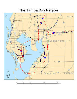
The spline label for the Tampa Bay Estuary was a bit tricky - I had to redo it a few times to get it to fit within the Bay.


2. Learning ArcGIS Spatial Analyst


I had some problems with getting some of the tools to run, including reclassification using the ASCII file, which others have had problems with too, according to the discussion posts.


Modelbuilder image:


Vegetation reclassification map:


3. Learning ArcGIS 3D Analyst


Neat! I hope to have some time later to explore 3D more!


Monday, March 22, 2010

WEEK 9 LAB: VECTOR ANALYSIS


Q1: Which tool did you use? Was there any noticeable difference between its results and the results from the instructions?
I used the Intersect tool. There were no noticeable differences between the results.

Q2: Which tool did you use here? Why?
I used the Erase tool, because it creates a feature class outside of the erase feature class, in this case outside of the conservation areas.

Q3: How many features are in this layer? What is the area of the largest feature? What is the area of the smallest feature?
There were 79 features in this layer. The area of the largest feature was 776 503 square meters, while the area of the smallest feature was 748 square meters.

I enjoyed this lab, and used a png format for the image of the map, instead of jpeg. The file size was a lot smaller at a higher resolution. So I'd consider using this format in future for posting maps to the blog.

Tuesday, March 2, 2010

WEEK 7 LAB: DATA EDITING


Again, a simple lab but very slow to do due to slow processing of imagery.


Thursday, February 25, 2010

WEEK 6 LAB: GEOREFERENCING

This lab was simple but it took forever to do! Working with the imagery was extremely slow and although I wanted to spend more time putting together the map, it took me hours just to get to this stage.

Sunday, February 21, 2010

WEEK 5 LAB: DATA SEARCH

Wow, this has been quite some lab!! And judging by the discussion posts, I am not the only one who thinks so. I have learnt a lot though and its been a good revision of what we have learnt so far.

MAP 1. RASTER DATASETS


MAP 2. INVASIVE PLANTS AND STRATEGIC HABITAT CONSERVATION AREAS


MAP 3. PUBLIC LANDS, HYDROGRAPHY, ROADS AND CITIES


I was excited about the fact that I was doing Monroe County, the Everglades State. But it was challenging to try to represent the public lands and the hydrographic features, since much of the state seems to be under water and public land. The Keys were particularly challenging since they are so small relative to the mainland, but also very long for an inset map. Hopefully with more experience I will learn how to do a better job.


Thursday, February 11, 2010

WEEK 4: HAITI EARTHQUAKE

I found the following two maps when searching for good and bad maps for our Cartography course. I was interested to see how satellite imagery was used to assess the extent of damage (in the first map) and to be able to pinpoint physical barriers to providing humanitarian disaster relief (in the second map). The first map would have been useful to pinpoint areas to focus relief efforts upon. And the second map would have been useful to plan the logistics of early relief efforts.


With such awesome technology at the relief agencies fingertips one does rather wonder what went wrong. However, this being the poorest country in the western hemisphere (aided and abetted by the IMF and their ilk I see), I expect the logistical challenges to the relief efforts would be similar to here in Malawi, where we had our own little earthquake hours before the Haiti Earthquake struck. No casualties for that one, although 1000s of people remain homeless in Karonga district after a flurry of earthquakes over the past few months.


Wednesday, February 10, 2010

WEEK 4 LAB: PROJECTIONS OF FLORIDA

This week's assignment introduced us to different map projections or coordinate systems. We used a map of Florida to compare three different coordinate systems: Albers, State Plane and UTM.


The area for Escambia county differed the least between projections while that for Miami-Dade differed the most. Escambia is the most northerly county and Miami-Dade the most southerly. This difference probably occurred because we used State Plane Florida North and UTM 16 N. Escambia county falls within these zones, whereas the other two counties fall within UTM 17 N and one of the other State Plane zones. We would therefore expect more distortion of areas in counties within these zones. The Albers projection should show the correct area of each county as it is an equal area projection.

Friday, February 5, 2010

WEEK 3 LAB: MEXICO

Our task this week was to play around with data from Mexico.


MAP 1

Clear, simple and straightforward. I have now learnt how to move the continents around and place them better within the map. So much for continental drift ...


MAP 2
This was a difficult map to do in terms of making it look good. The map is cluttered and I am not sure what the purpose of this map would be (other than to have us practice making a map). I stumbled upon the setting to add a halo around the text and I think it helps to make the annotations on the map clearer.


MAP 3


My first attempt to display a raster data set. I would not have thought so, but I like the contrast between the red and blue in terms of showing elevation. Blue is usually reserved for water features, but it was fun being able to use it to represent land for a change.

Monday, February 1, 2010

Week 2 Lab

World Population Map


The most difficult thing about this week's assignment was the map layout. How to align scale bars and scale text and sizing the map correctly was not immediately obvious.

Thursday, January 28, 2010

Week 1 Lab

Finally I have access to the course software, and am able to start using ArcMap! I have quite some catching up to do.


Module 1: Exploring a GIS Map


Excercise: Planning a trip to San Diego


I found the ESRI Virtual Campus course instructions simple and easy to follow and had no problems with this first assignment. It is good to start getting a feel for how GIS works.


Module 1: Using GIS to Solve Problems


Excercise: Find potential sites for a Youth Center


I had a few more problems here, but that was only because I lost the remote desktop connection half way through the excercise. Luckily I had saved the file and only had to repeat a few steps. Lesson learned! Don't forget to SAVE!

I played around a bit with the map layout. I change the text size of the labels and legends, but I did not find this very intuitive. I had to ask for help.

Looking forward to finding out more about what ArcMap can do!

Thursday, January 7, 2010

Happy New Year and welcome to my Intro to GIS blog, from a sunny, warm and humid Lilongwe.